Family Promise
Using card sorting and data visualization to transform a cluttered nonprofit website into a clear, trust-building resource.
19 Pages → 6 Main Sections
From Chaos to Clarity
Imagine trying to navigate a website where critical information is buried under layers of redundancy—where "Our Story" and "Our History" are separate pages, yet neither fully answers your questions.
For Family Promise of Salt Lake, a nonprofit dedicated to supporting families experiencing homelessness, this was the reality. Their outdated, cluttered website risked undermining trust with the very people who needed them most: families in crisis, potential donors, and volunteers.
As the sole UX researcher and designer for my senior capstone project, I led a 5-week initiative to redesign the organization's information architecture. With no direct access to end users, I turned to card sorting and custom data visualization to uncover how people intuitively organized the site's content.
The Result
A streamlined sitemap that reduced 19 pages to 6 main sections, eliminated redundancy, and positioned Family Promise as the professional, trustworthy organization it truly is.
Project Details
Role
UX Researcher, Designer & PM
Timeline
July–August 2025 (5 weeks)
Team
Solo UX + Developer Partner
Context
Senior Capstone Project
Client
Family Promise of Salt Lake
The
Problem
The Challenge
Family Promise of Salt Lake's website suffered from years of accumulated content without strategic oversight. The sitemap had ballooned to 19 pages filled with overlapping, outdated, and poorly organized information.
Key Issues
- • Redundancy: Multiple pages covered similar content ("Our Story," "Our History," "About Us")
- • Poor Hierarchy: Critical actions buried in submenus
- • Unclear Structure: Users couldn't predict where to find information
- • Trust Erosion: Cluttered navigation signaled disorganization
The Constraint
Without direct access to the nonprofit's end users, I needed an objective, research-backed method to understand how people expected the site to be organized.
Who We're
Designing For
Before restructuring the site, I identified three distinct user groups with different needs and goals:
Families in Crisis
Primary Need: Fast access to "Get Help" resources
Behavior: High-stress browsing, need immediate clarity
Pain Point: Can't afford to hunt through menus when facing homelessness
Potential Donors
Primary Need: Verify legitimacy and understand impact
Behavior: Looking for mission, financials, success stories
Pain Point: Disorganized sites signal mismanagement, reduce donation likelihood
Volunteers
Primary Need: Find opportunities and understand time commitments
Behavior: Comparing multiple organizations, need clear info
Pain Point: Vague or scattered volunteer info leads to drop-off
Design Implication
The sitemap needed to serve high-stress urgent users AND leisurely research-oriented users—requiring both prominent critical actions and clear exploratory paths.
Research
Process
Why Card Sorting?
Card sorting reveals users' mental models—how they naturally group and categorize information. Without access to Family Promise's actual users, this method let me gather objective data about information organization from representative participants.
Content Extraction
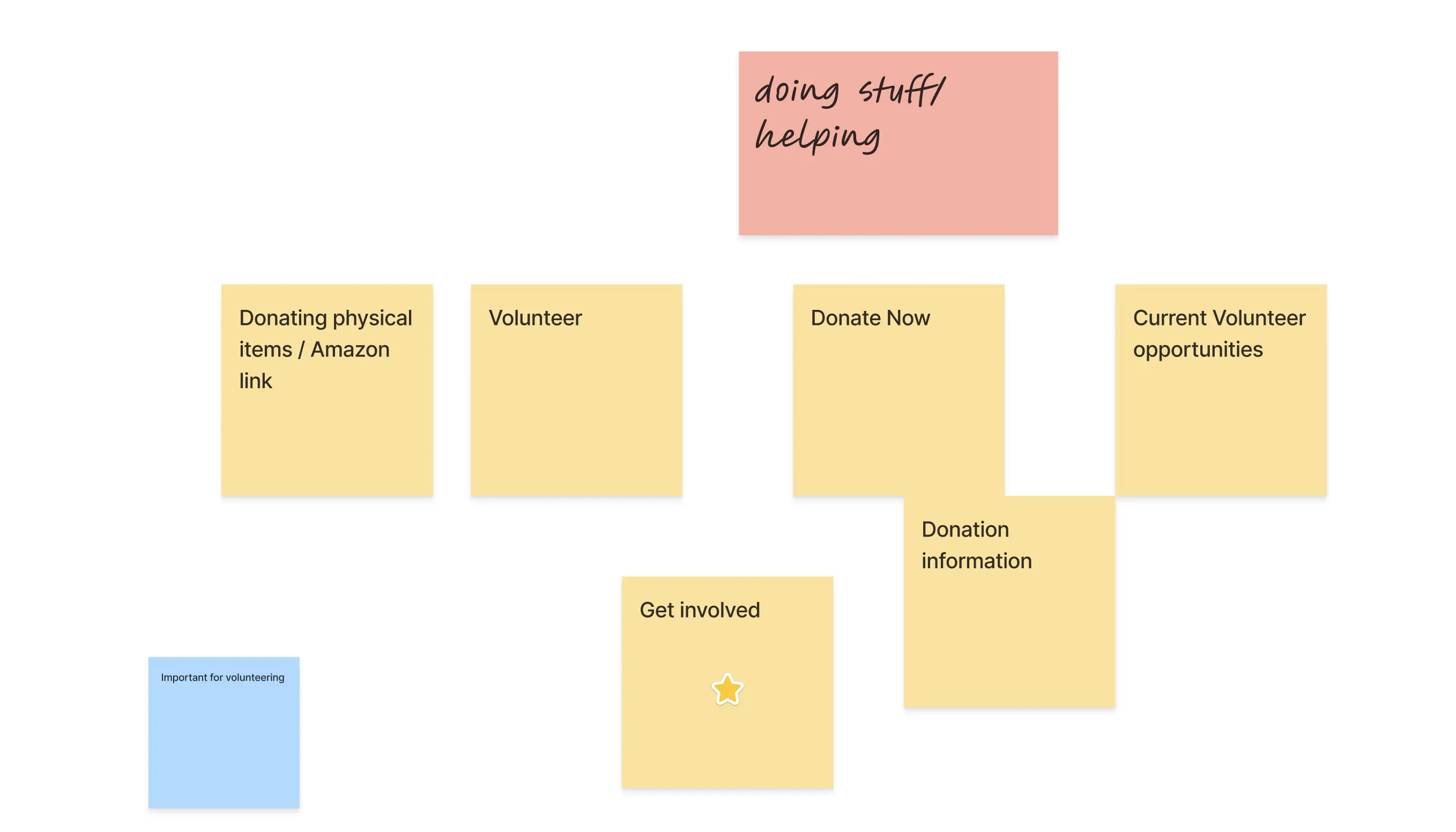
I audited the existing sitemap and extracted every topic, page name, and major content section. This became exactly 20 individual "cards" in FigJam—each representing a discrete piece of information users might need.
Participant Recruitment
Recruited 10 participants through personal networks and my developer partner Matthew. Mixed demographics to represent diverse user perspectives, with no prior relationship to Family Promise (unbiased mental models).
Participants created between 4 and 7 groups each, revealing diverse mental models while showing underlying patterns.
Session Design
I wrote a facilitation script to ensure consistency across sessions. Participants grouped cards in ways that made sense to them while using "think aloud" protocol to capture their reasoning.
Cross-Disciplinary Collaboration
I trained developer Matthew to facilitate sessions alongside me, doubling our capacity and exposing him to UX research methods. This reinforced the value of cross-functional partnership.
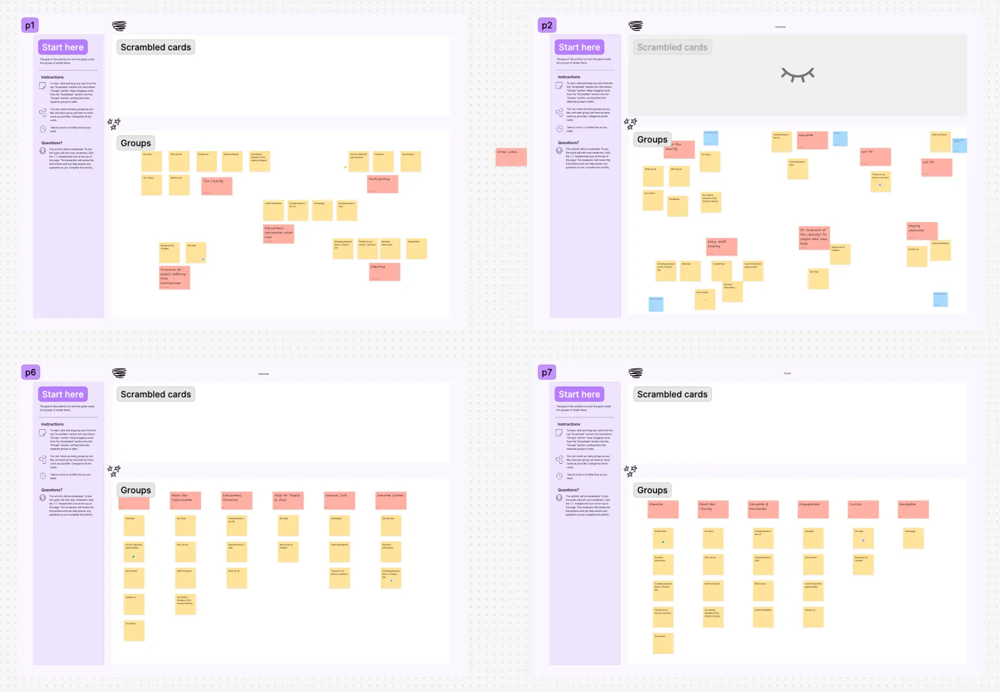
Remote card sorting sessions conducted via FigJam
Data Analysis
From Overwhelm to Insight
After 10 sessions, I had 10 completely different card groupings. Some participants created 4 categories. Others created 7. Card labels varied wildly ("Help" vs. "Get Support" vs. "Services").
The question: How do you identify patterns in this chaos?
The Solution: Data Visualization
1. Data Compilation
I compiled the card sort data into a structured spreadsheet, tracking which cards each participant grouped together across all 10 sessions. This raw data became the foundation for generating visualizations that would reveal patterns.
2. Custom Python Scripts
I researched hierarchical clustering methods and wrote Python scripts (with ChatGPT assistance) that transformed my data into visual formats:
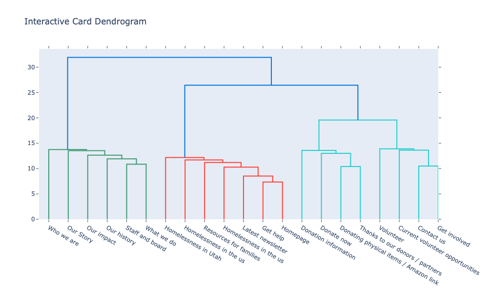
- 📊 Dendrogram (Tree Diagram): Shows hierarchical relationships between cards, reveals which content naturally "belongs together"
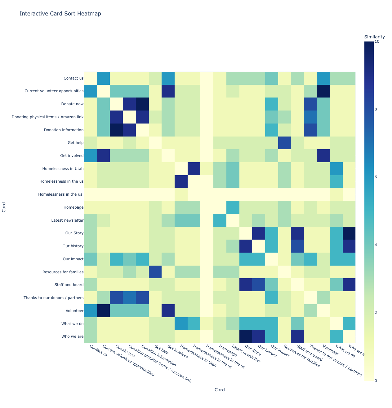
- 🗺️ Heat Map: Color-coded matrix showing co-occurrence frequency—darker colors indicate stronger relationships
Interactive Visualizations
The dendrogram and heat map below are fully interactive. Click to explore the data and see how participants grouped content.
Note: Opens in new tab for full-screen interactive experience
Pattern Identification
The visualizations revealed clear clusters:
- ✓ "Who We Are" content (Our Story, Our Impact, Our History, Staff and Board) formed a tight cluster—validating that users saw these as variations of the same information need
- ✓ "What We Do" (program information, homelessness context) grouped together
- ✓ Resources and Help formed their own distinct area
- ✓ Get Involved actions (Donate, Volunteer, Contact) clustered as a separate engagement category
Translating
Insights into Design
The Dendrogram-to-Sitemap Process
The dendrogram provided structure, but data doesn't dictate design—it informs it. I adapted the clusters based on:
- • User Priorities: Families in crisis need immediate access to help
- • Business Goals: Nonprofit sustainability requires visible donation pathways
- • Content Strategy: Merge redundant pages, eliminate outdated content
The New Sitemap
Before: 19 Pages
- • Home / Landing Page
- • Who We Are
- • Our Story
- • Our Impact
- • Staff and Board
- • What We Do
- • Get Involved
- • Donation Information
- • Current Volunteer Opportunities
- • Resources for Families
- • Additional Resources (duplicate!)
- • Homelessness in Utah
- • Homelessness in the US
- • Latest News
- • Tour Our Facility
- • Contact Us
- • Employment Opportunities
- • Need Help?
- • Get Help (separate from "Need Help?"!)
After: 6 Main Sections + Home
- 1. Homepage - Mission, stats, newsletter
- 2. Who We Are - Our Story, Staff & Board
- 3. What We Do - Our Impact, How Program Works
- 4. Resources for Families - Educational content
- 5. Get Help - What to expect, Form
- 6. Get Involved
- → Donate (Amazon, Money, Impact, Thanks)
- → Volunteer (Info, Opportunities)
Key Structural Changes
- ✓ Eliminated redundancy: "Resources for Families" and "Additional Resources" were duplicate pages—consolidated into one
- ✓ Removed standalone pages: "Our History," "Homelessness in Utah," "Homelessness in the US," "Latest Newsletter," "Tour Our Facility," "Employment Opportunities" were either merged or removed
- ✓ Elevated critical actions: "Get Help" promoted to top-level on mobile (already was on desktop)
- ✓ Clarified hierarchy: "Donate" and "Volunteer" became clear sub-categories of "Get Involved"
Key Design
Decisions
"Get Help" Placement
The Data: Card sorting showed "Get Help" as a distinct category, but placement varied
My Decision: Ensured it was top-level on both desktop AND mobile (it was already top-level on desktop, but I elevated it on mobile navigation)
Reasoning: Families in crisis can't hunt through hamburger menus on mobile devices. This action needed to be immediately visible regardless of screen size.
"Donate" Visibility
The Data: Some participants grouped "Donate" deep in "Get Involved"
My Decision: Kept it prominent in main navigation
Reasoning: Nonprofit sustainability depends on visible donation pathways. Data informs, but business viability matters.
Content Consolidation
The Data: "Our Story," "Our History," "About Us" grouped together by 90% of participants
My Decision: Merged into single "Who We Are" section with subsections
Reasoning: Users saw these as variations of the same need—validating the consolidation.
Handoff to
Development
I delivered the redesigned sitemap and Figma prototypes of key pages to developer Matthew for implementation. Family Promise leadership approved the new structure, and the site is currently in development.
Current Status: Sitemap approved and in development phase
Key Artifacts
- • Card sorting facilitation script
- • Compiled card sort data (10 participant sessions)
- • Interactive dendrogram visualization (HTML)
- • Interactive heat map visualization (HTML)
- • Redesigned sitemap
- • Figma prototypes (Homepage, Get Help, Donate, Who We Are)
Impact &
Outcomes
Reduction in page count (19 → 6 sections)
Participant sessions revealing mental models
Cards sorted across all sessions
Structural Simplification
- • Reduced sitemap from 19 pages to 6 main sections (plus homepage)
- • Eliminated redundant pages: Merged duplicate "Resources" pages, removed standalone "Our History," consolidated homelessness educational content
- • Removed unnecessary standalone pages: "Tour Our Facility," "Employment Opportunities," "Latest Newsletter" either merged into parent sections or eliminated
- • Clarified structure: Created clear parent-child relationships instead of flat navigation
User-Centered Prioritization
- • Elevated "Get Help" to top-level on mobile (responding to high-stress user needs)
- • Created structure aligned with user mental models from 10 card sorting sessions
- • Improved predictability—users can now anticipate where information lives
Research Validation
The card sorting data provided objective validation for difficult decisions. When stakeholders questioned merging "Our Story" and "Our History," I could point to 90% participant agreement. The dendrogram and heat map made abstract IA decisions tangible and discussable.
Lessons
Learned
Creativity Under Constraints
Without direct access to Family Promise's users, I used card sorting and custom data visualization to uncover mental models. Sometimes constraints force better solutions than unlimited access would—I had to be more creative and rigorous with my methods.
Learning: Resourcefulness can overcome research limitations. The tighter the constraints, the more innovative your methods need to be.
Working Through Uncertainty
When organizational transitions limited stakeholder availability, I leaned on card sorting data and nonprofit best practices to make autonomous design decisions. The new leadership's approval validated my approach.
Learning: Strong research creates confidence even when business context shifts. Build work that can stand on its own.
Cross-Disciplinary Collaboration
Training developer Matthew to facilitate card sorting sessions expanded our research capacity and gave him firsthand exposure to UX methods. He understood the "why" behind decisions, not just the "what."
Learning: Involving developers in research creates better implementation. When team members understand user needs directly, they make smarter trade-offs.
Data Informs, Doesn't Dictate
The dendrogram suggested certain groupings, but I adapted them to prioritize real-world needs—like pulling "Get Help" to top-level navigation despite clustering data, because families in crisis can't hunt through menus.
Learning: Research provides confidence to make human-centered decisions, not algorithmic ones. Use data to inform your judgment, not replace it.
Reflection &
Next Steps
What Worked Well
- • Card sorting provided objective foundation for subjective decisions
- • Custom visualizations made complex data accessible
- • Remote research methods proved effective and scalable
- • Autonomous decision-making (when necessary) built confidence
What I'd Do Differently
- • Test with actual users who've experienced homelessness
- • Explore specialized tools like Optimal Workshop
- • Conduct follow-up validation with the new structure
- • Advocate for ongoing IA governance to prevent future sprawl
Final Thought
This project reinforced that UX isn't just about pixels—it's about organizing information in ways that build trust. For a nonprofit like Family Promise, where families in crisis are making high-stakes decisions about seeking help, that trust is everything.