Magic Mirror
A smart closet interface that eliminates outfit planning stress through integrated weather, schedule, and wardrobe management.
The Problem
Planning what to wear is a daily frustration that wastes time and mental energy.
People pull out multiple outfits, change several times, and still walk outside unprepared for the weather or day's activities.
Design Goal
Create a smart mirror interface that displays closet, weather, and schedule in one glanceable view.
Project Details
Role
UX Designer
Duration
2 Weeks
Team
3 Designers
Tools
Figma, ChatGPT
Key
Considerations
Weather
What's the temperature and forecast? Will I need an umbrella or jacket?
Schedule
Work meeting, job interview, casual dinner, or gym session?
Preferences
Personal style, comfort levels, and what makes you feel confident.
Availability
What clothes are clean and accessible in your closet right now?
Key Insight
While weather apps and closet apps exist separately, no solution combines wardrobe, weather, and calendar in a single glanceable interface.
Competitive
Analysis
We analyzed existing solutions across four categories: smart mirrors (Lululemon Studio Mirror), closet management apps (Indyx), outfit styling services (Stitch Fix), and smart closets (LG Styler).
None of them combined wardrobe, weather, and calendar in a single glanceable interface. That gap became our design goal.
Smart Mirrors
Lululemon
Fitness focus, no wardrobe integration
Closet Apps
Indyx
Wardrobe only, no weather or calendar
Styling Services
Stitch Fix
Outfit help, but no real-time context
Smart Closets
LG Styler
Cleans clothes remotely, no outfit planning
Initial
Exploration
Sketching allowed us to explore concepts rapidly without worrying about pixel perfection. The focus was on ideas, not polish.
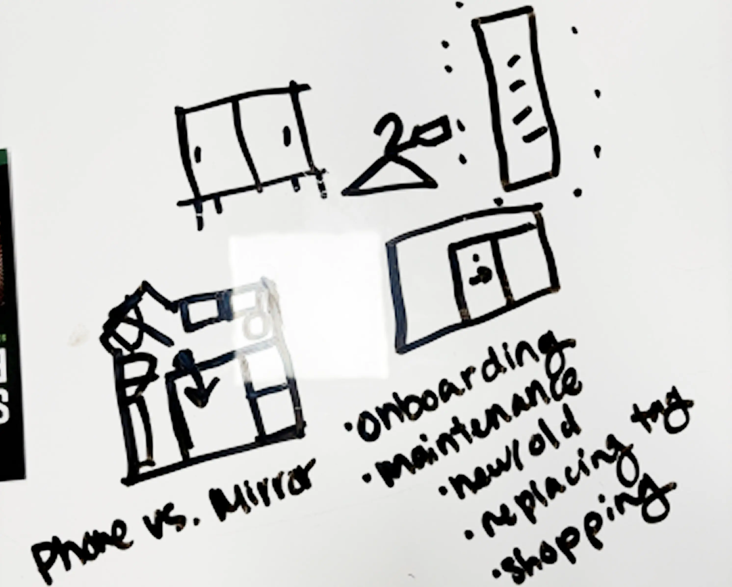
Phone vs. mirror — early concept exploration
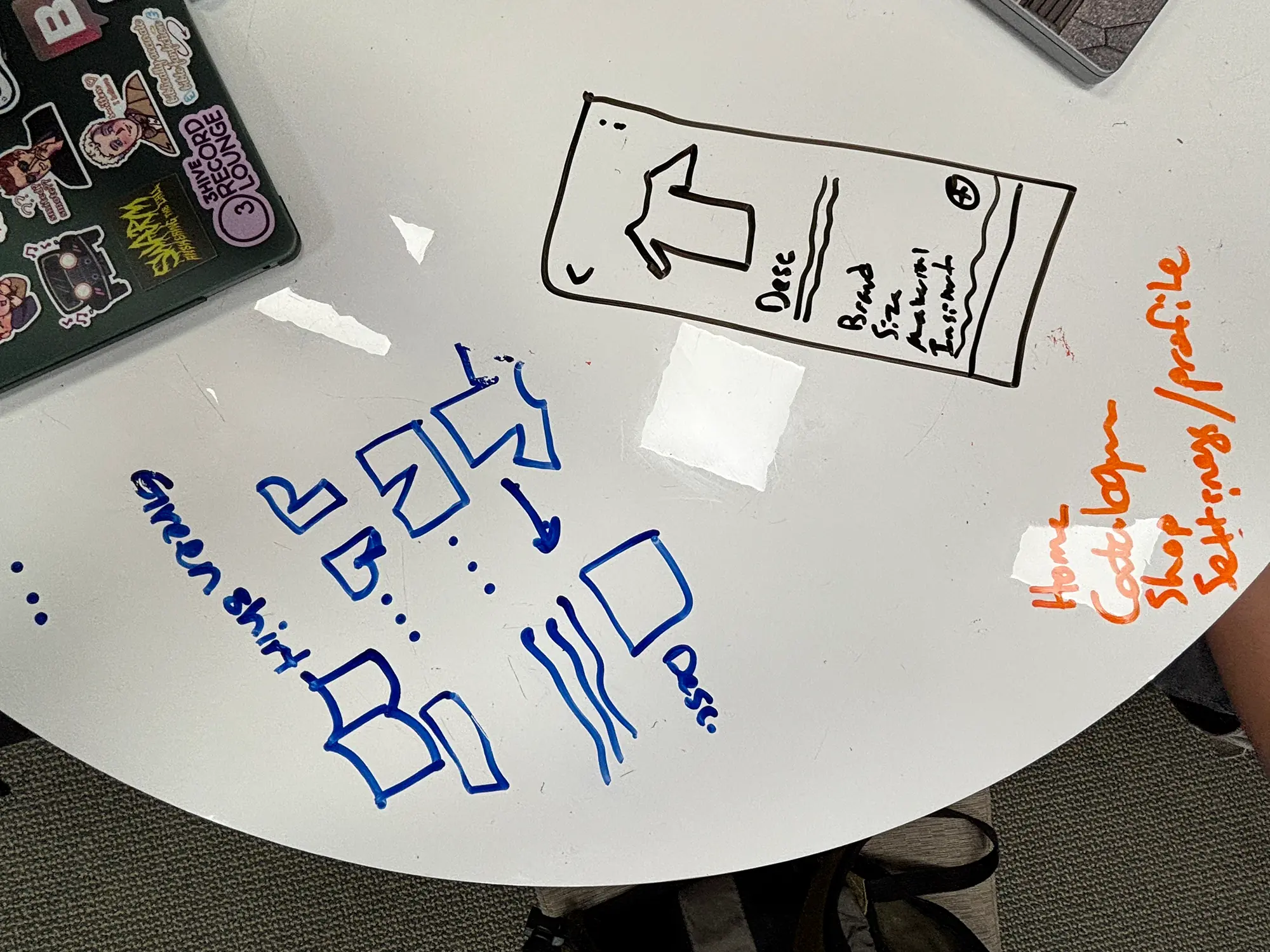
Screen structure and navigation ideation
Key Questions
- • Mirror or mobile app?
- • Individual items vs. complete outfits?
- • Essential vs. nice-to-have features?
The Flatlay Problem
My initial approach was a "flatlay" layout—displaying clothes in the order they're worn (hats → jackets → pants → shoes). It felt immersive and natural.
The problem: I couldn't make it work aesthetically. The spacing felt awkward, and it didn't scale across different screen sizes.
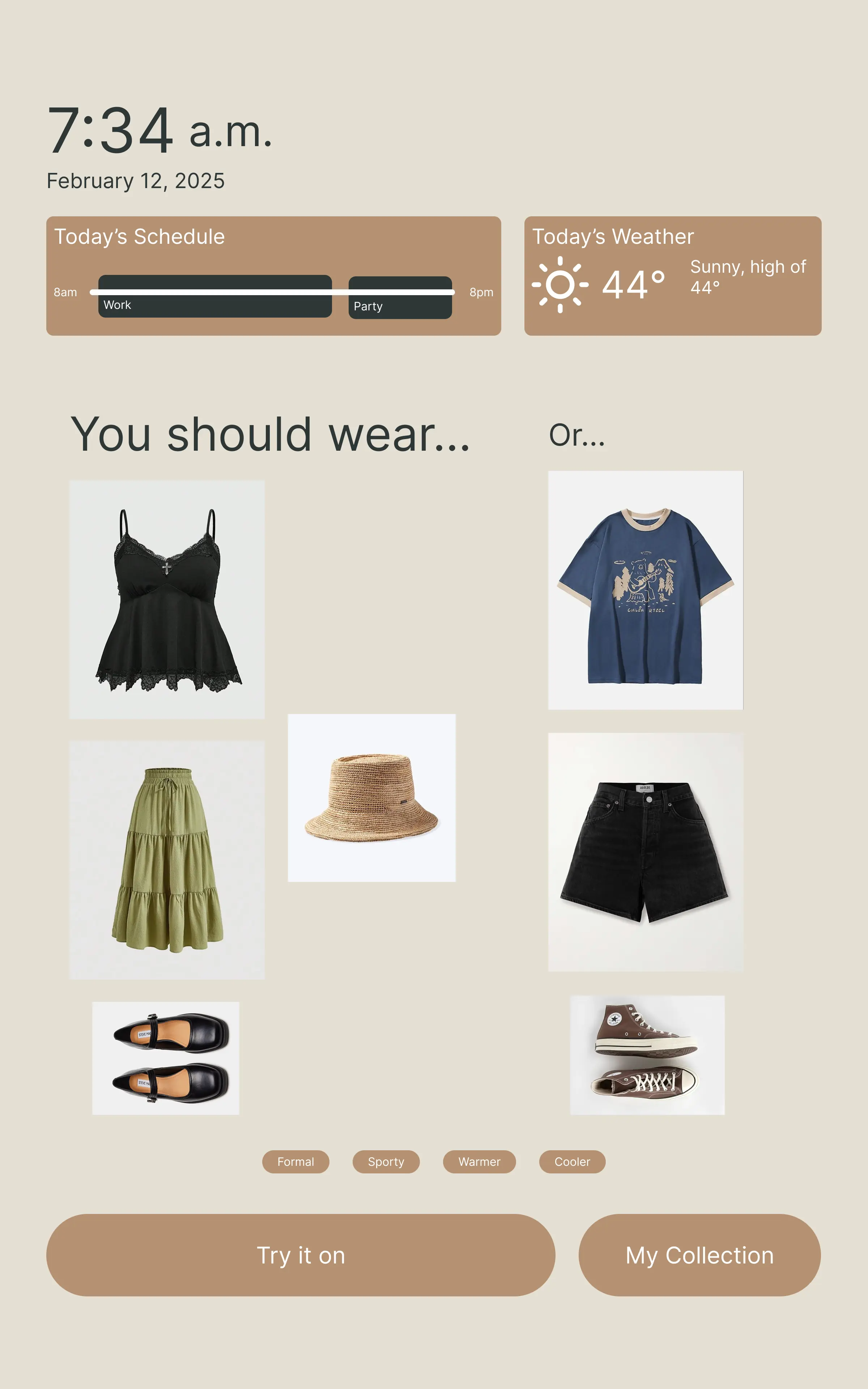
Original approach - flatlay layout
Team Collaboration Wins
My teammate Shelby had designed the mobile app using a horizontal scrolling card layout. After reviewing her work, I realized this approach was:
- More flexible for different screen sizes
- Easier to scan quickly
- Consistent across platforms
"Even though the flatlay was more immersive, cross-platform consistency was more valuable."
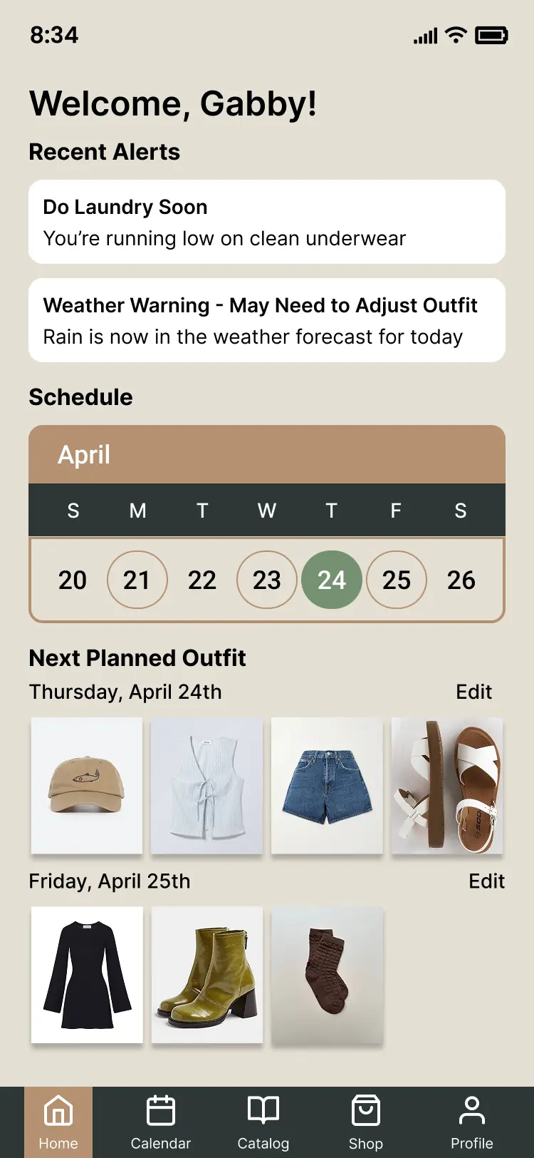
Shelby's card-based approach
Usability
Testing
Testing with 5 users revealed critical usability issues we never anticipated.
Invisible '+' Button
0/5 users could find the button to add clothing without prompting—it was buried at the end of a scrollable row.
Hidden Scrolling
Users didn't realize the clothing row scrolled horizontally—they thought what they saw was everything.
Confusing Calendar
Calendar icons and date indicators were misinterpreted—users couldn't distinguish their meaning.
Messy Weather Layout
Users confused hourly and daily forecasts, treating the two-column layout as a single dataset.
"I love getting feedback like this because it's like a light comes on when I'm designing. I can see! I know what the users need."
Iterating on
Feedback
Making the '+' Button Discoverable
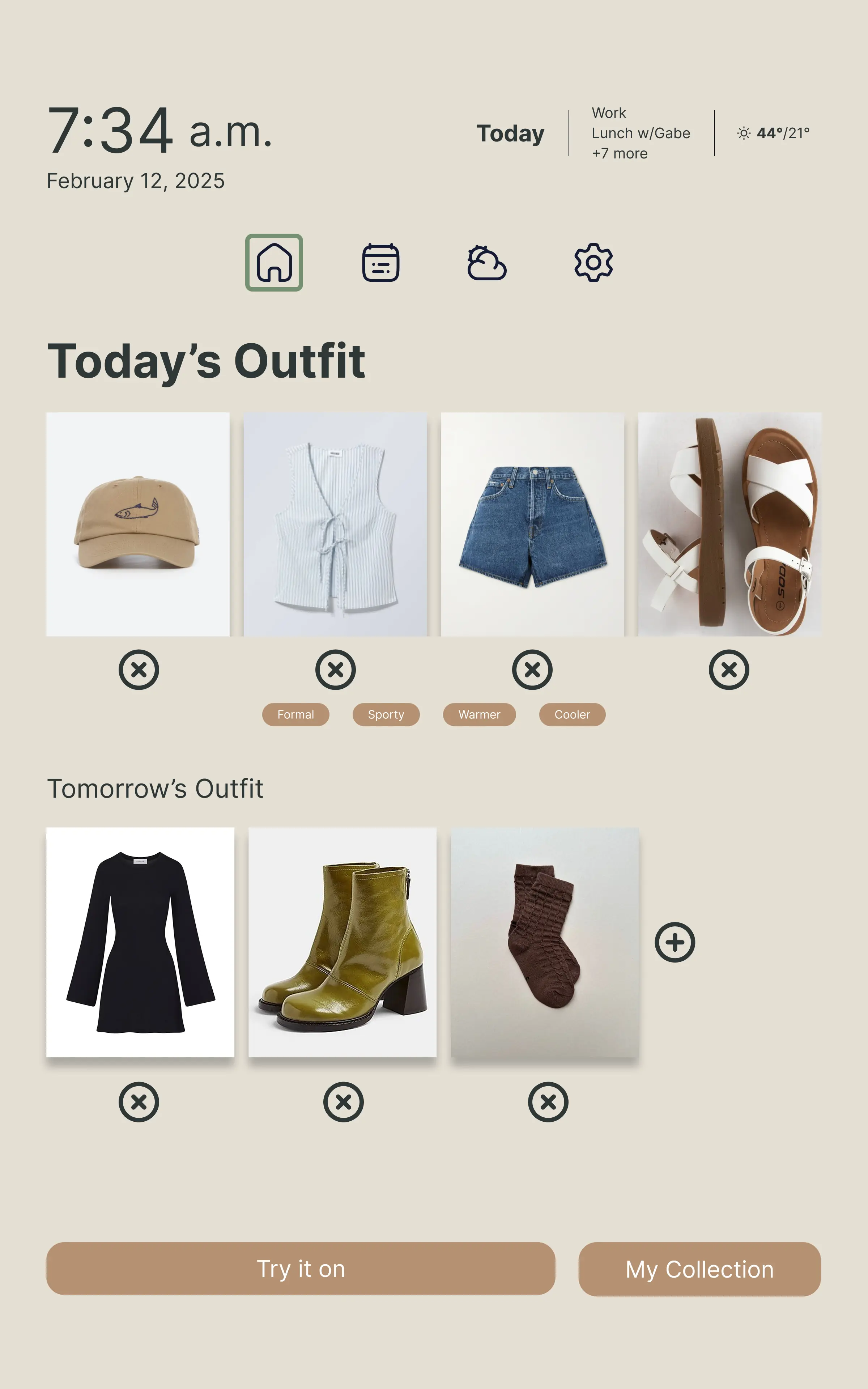
Button buried at end of scrollable row
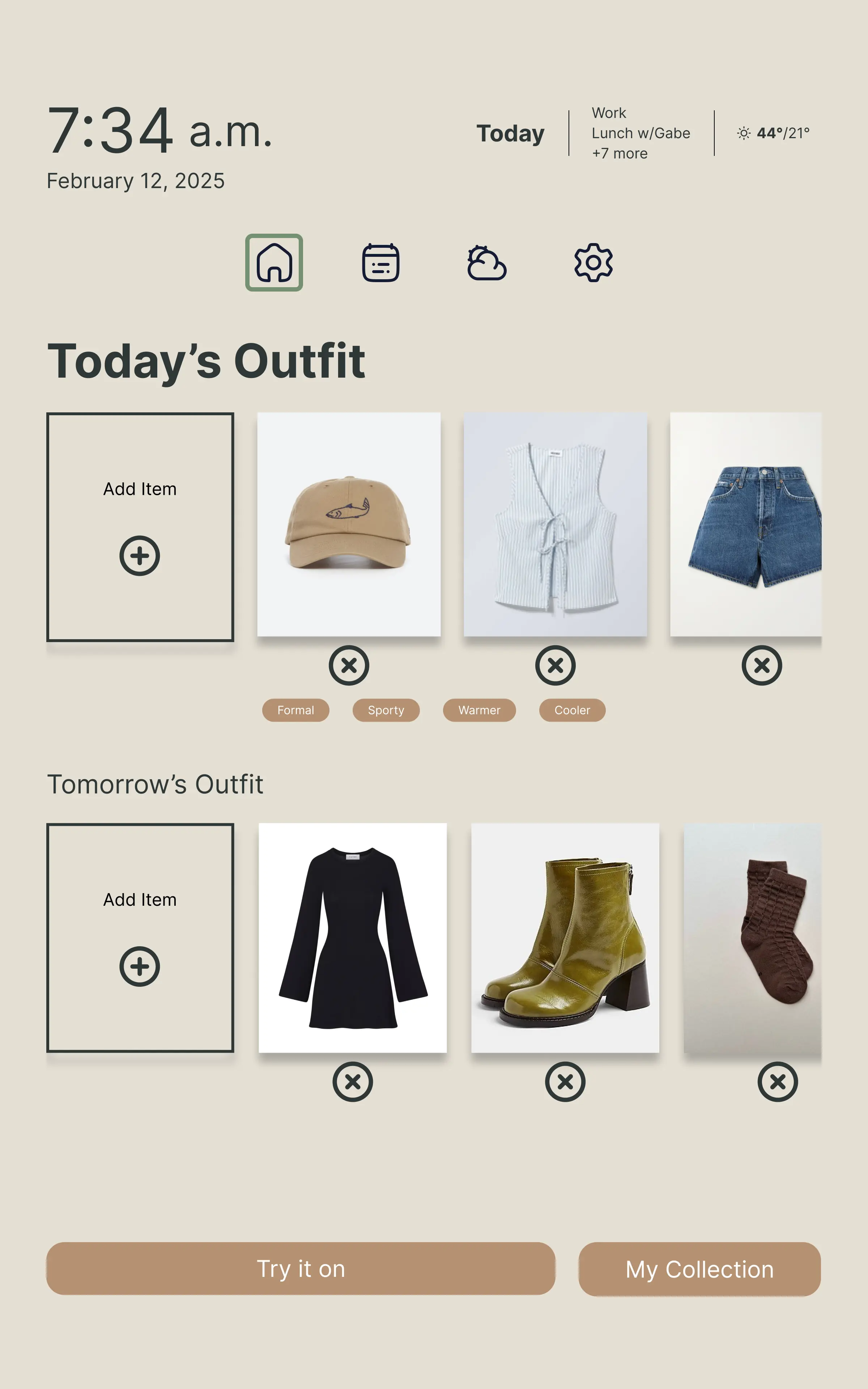
Prominent '+' button at the front (inspired by Facebook Stories)
Impact: 5/5 users successfully added clothing items in follow-up testing.
Redesigning the Weather Interface with AI Assistance
ChatGPT's Recommendations
- • Add a prominent current conditions section at the top
- • Make hourly and 10-day forecasts horizontally scrollable
- • Use distinct visual styling to differentiate forecast types
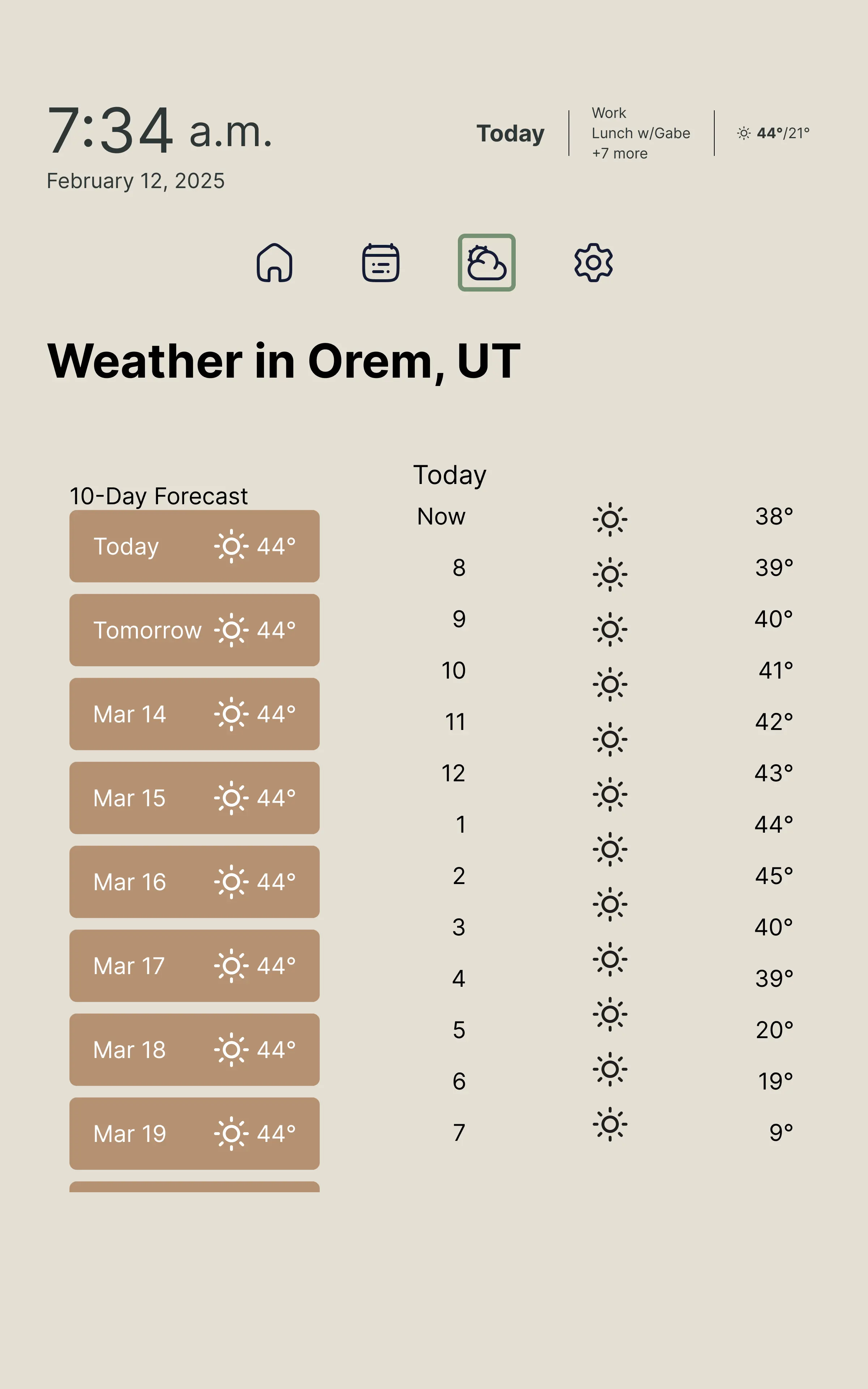
Original: Confusing two-column layout
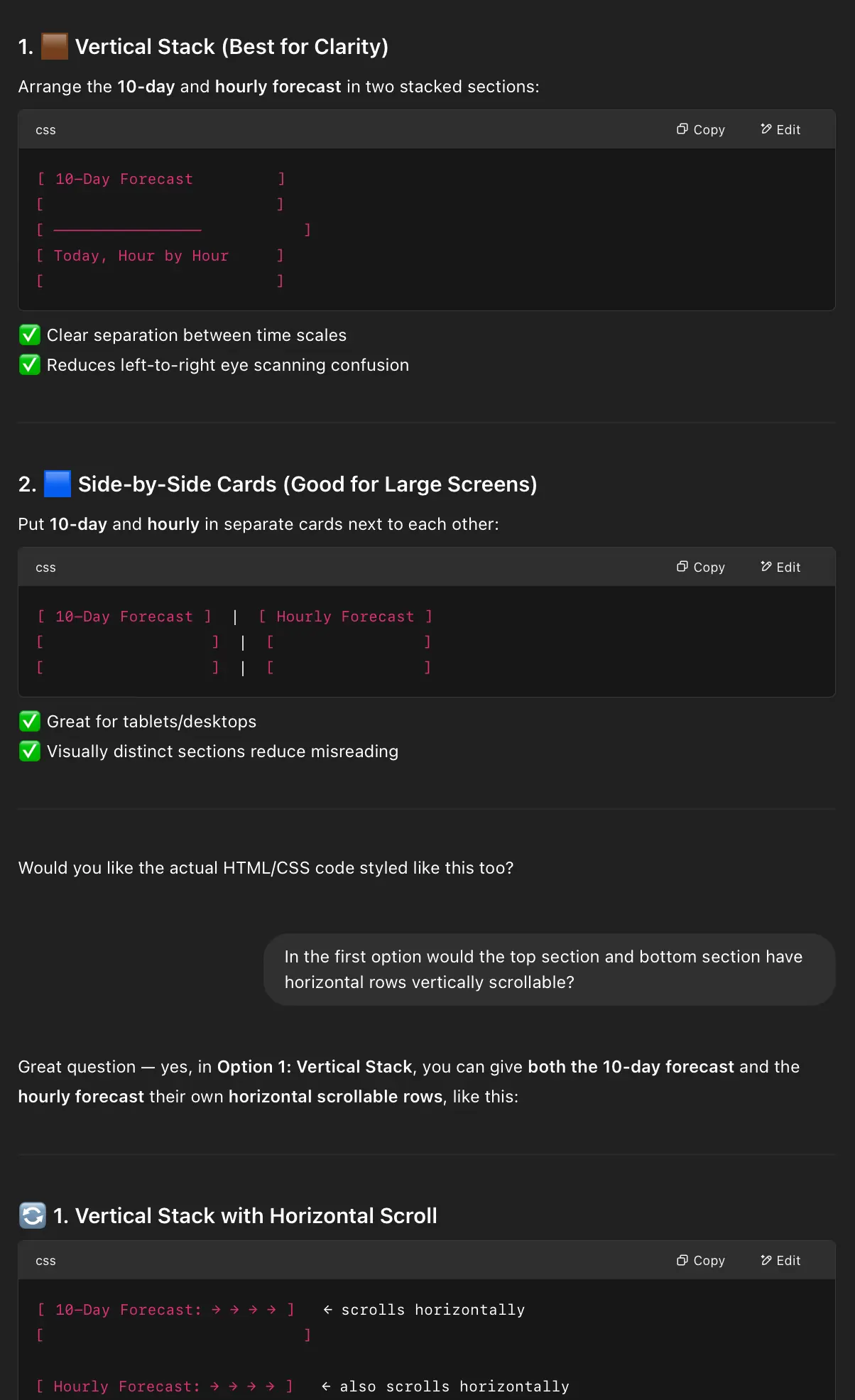
ChatGPT's suggestion mock-up
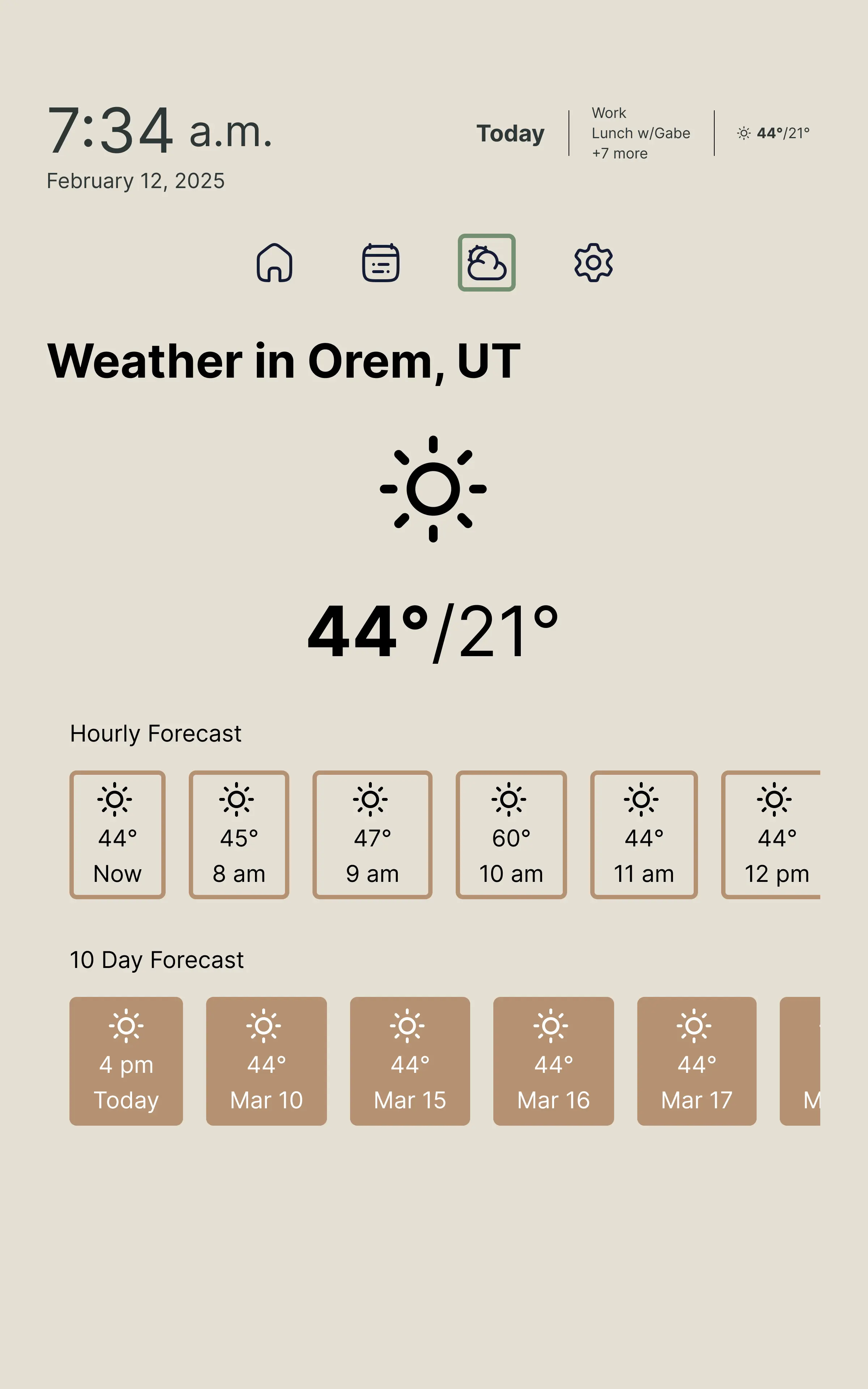
Final: Clear hierarchy and scrolling
Impact: Weather comprehension time dropped from 45+ seconds to under 10 seconds.
Final
Design
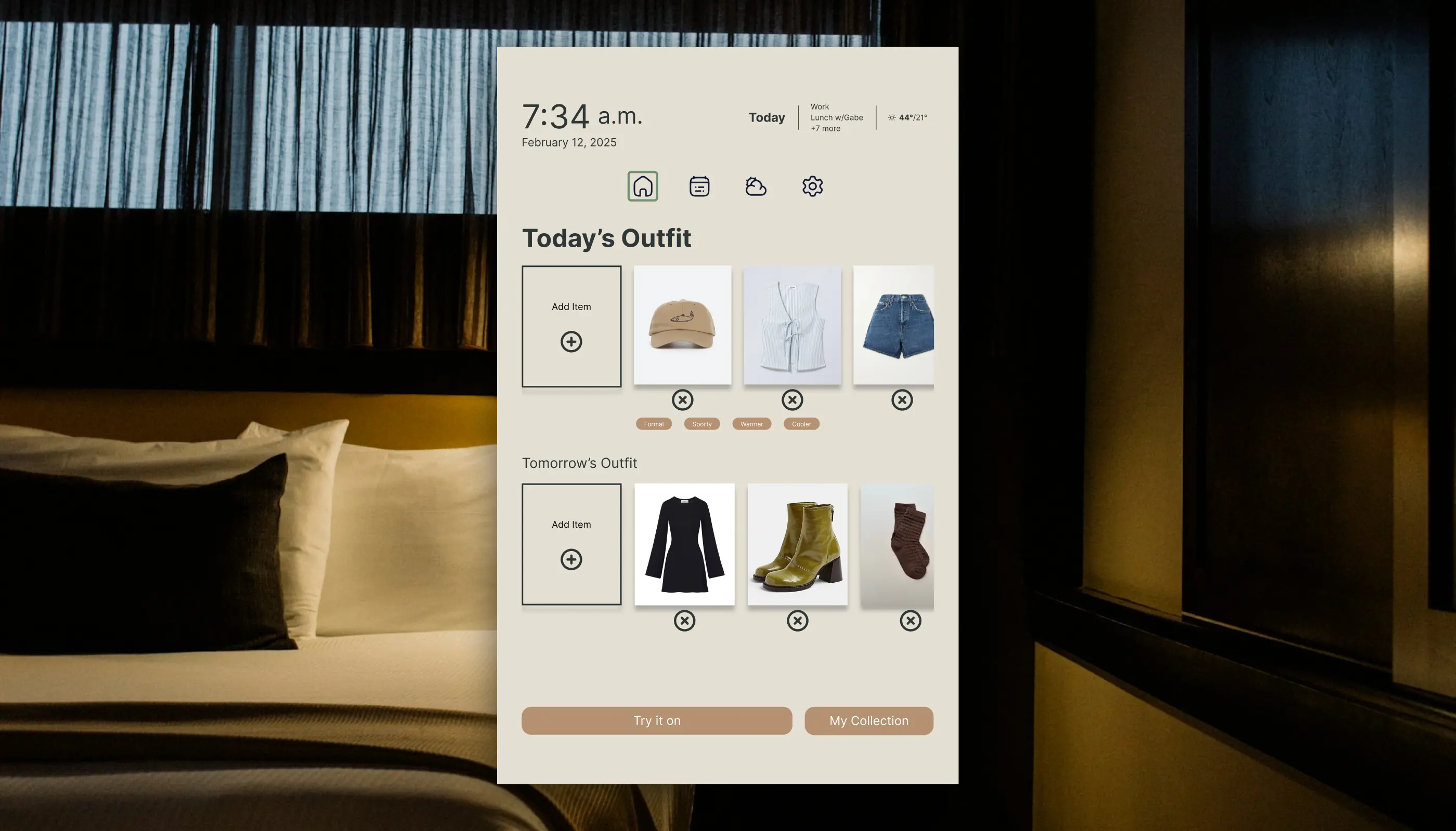
Prominent '+' Button
Easy clothing addition
Scrollable Preview
Browse full outfit
Weather At-a-Glance
Current conditions prominent
Quick Access
Settings & detailed weather
Impact
Before Iteration
After Iteration
"I would actually use this every morning—it solves a real problem I have."
— Usability Test Participant
"The weather layout makes so much more sense now. I can see what I need immediately."
— Usability Test Participant
Key
Takeaways
AI as Design Advisor
ChatGPT helped me identify established UI patterns I hadn't considered, but I still needed to validate suggestions, adapt to our context, and make final decisions based on usability principles.
Learning: AI tools accelerate research and ideation, but human judgment is essential for contextual design decisions.
Collaboration Over Individual Vision
I was attached to the flatlay concept because it felt "innovative," but Shelby's card layout was clearly superior when I evaluated both objectively. Setting ego aside led to a better solution.
Learning: The best design isn't always the most novel—sometimes it's the one that works seamlessly across platforms.
Testing Reveals the Invisible
The '+' button was perfectly visible to me because I designed it. The weather columns made sense to me because I created them. Users saw neither.
Learning: Designer's curse of knowledge is real. Even informal testing reveals critical blind spots.
What I'd Do
Differently
Conduct Upfront Research
Interview 5-10 users about outfit planning to reveal needs we missed when relying on our own assumptions.
More Low-Fi Iteration
Gray-box wireframes would have let us test more layout variations before committing to high-fidelity.
Test Physical Context
Test with users standing in front of an actual mirror to reveal distance, angle, and lighting considerations.
Explore Input Methods
Design the wardrobe management flow—how users photograph and categorize their clothes.