National Park App
Making national parks accessible and exciting for newcomers through AR-powered wildlife collection and gamified exploration.
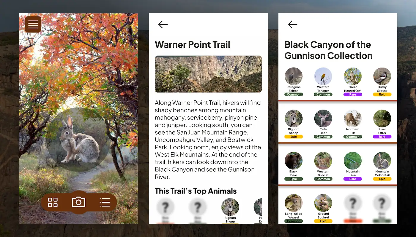
Final Design · Black Canyon of the Gunnison
Finding the Gap
During class discussions for our National Park app project, I noticed a pattern—everyone was designing trip-planning tools.
Trail maps, permit systems, camping reservations. My classmates and existing apps all targeted the same audience: experienced hikers who already knew they wanted to visit the park.
But what about people who find outdoor recreation intimidating? People who might be curious about national parks but don't know where to start? That's an underserved audience no one was designing for.
Design Opportunity
Create an accessible, engaging entry point for casual visitors—making the park experience feel achievable and fun, not intimidating.
Project Details
Role
UX/UI Designer
Duration
4 Weeks
Context
Academic Design Project
Park
Black Canyon of the Gunnison
Tools
Figma, FigJam
Competitive
Landscape
I surveyed existing National Park apps and reviewed my classmates' project proposals to understand the competitive space.
NPS Official App
Dense trail maps, permit systems, educational content
For: Park regulars
AllTrails
Route planning, difficulty ratings, user reviews
For: Serious hikers
Classmates' Apps
Trip itineraries, camping reservations, safety guides
For: Trip planners
The Gap
Every app assumed users already wanted to hike. No one was designing for newcomers who needed encouragement and guidance.
My positioning: Be the Duolingo of national parks—make outdoor recreation feel achievable and fun, not intimidating.
Who This Is For
Sarah, 28
Lives in Denver but rarely hikes
- • Curious about nearby national parks but finds them intimidating
- • Enjoys casual mobile games (Wordle, Pokémon GO nostalgia)
- • Wants Instagram-worthy experiences but doesn't know where to find them
- • Worried about getting lost or not being "outdoorsy enough"
What She Needs
A low-stakes, guided way to explore that feels more like a game than hardcore hiking. Something familiar, approachable, and rewarding—even for beginners.
Design
Strategy
Why Gamification?
Pokémon GO demonstrated that AR-based collection mechanics could get people who normally stay indoors excited about exploring their surroundings.
Players walked miles to find rare Pokémon, discovered new neighborhoods, and engaged with their environment in ways they never had before. What if we applied this proven mechanic to national parks?
The Parallel
Pokémon GO
Collect rare Pokémon → Explore neighborhoods
National Park App
Collect native wildlife → Explore trails
Strategic Decision
Leverage a familiar, proven engagement model. Make the park experience accessible and fun for newcomers by using interaction patterns they already understand.
Core
Features
AR Camera View
Scan wildlife in real-time using your phone camera—just like Pokémon GO
Wildlife Collection
Build your personal gallery of captured animals with educational info
Trail Integration
See which animals are found on each trail to guide your exploration
Leaderboard
Earn points for hikes and collections to climb the rankings
Initial
Design
I started with a moodboard on FigJam featuring Black Canyon of the Gunnison imagery, color palettes drawn from nature, and initial feature brainstorming.
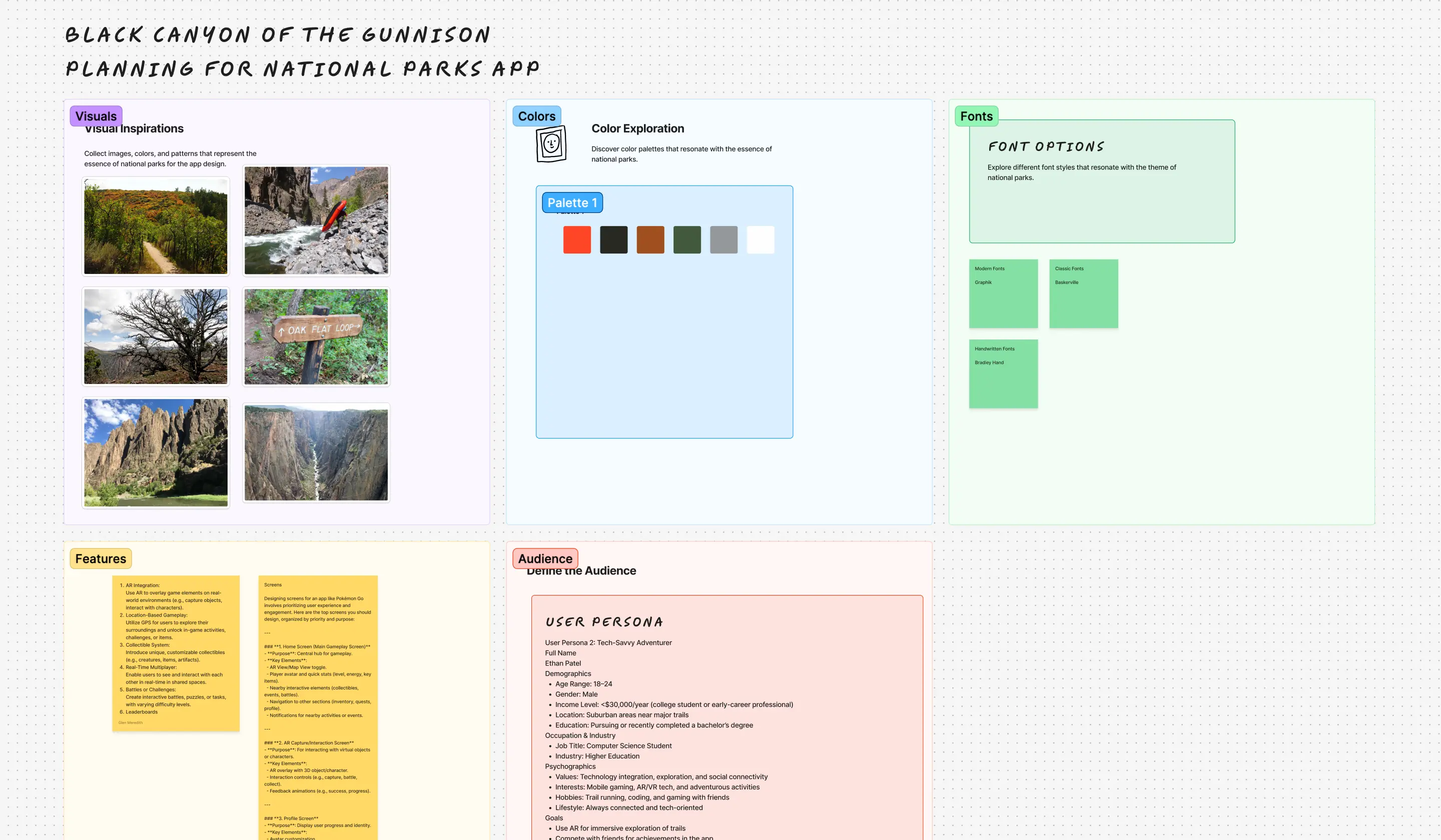
Moodboard exploring park aesthetics and app features
Sketching Key Screens
I sketched essential screens to explore how the app would work. For a Pokémon GO-style app, I knew I needed: AR camera view, capture confirmation, collection gallery, and trail information.
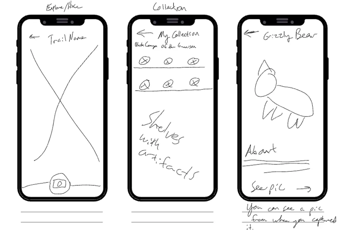
Early sketches exploring core screens and user flows
Learning from Users
After talking with a classmate who hikes regularly, I realized my initial hikes screen was missing critical information.
The insight: Hikers need to see trail photos (for visual appeal) and key stats like distance and elevation prominently displayed—not buried below the fold.
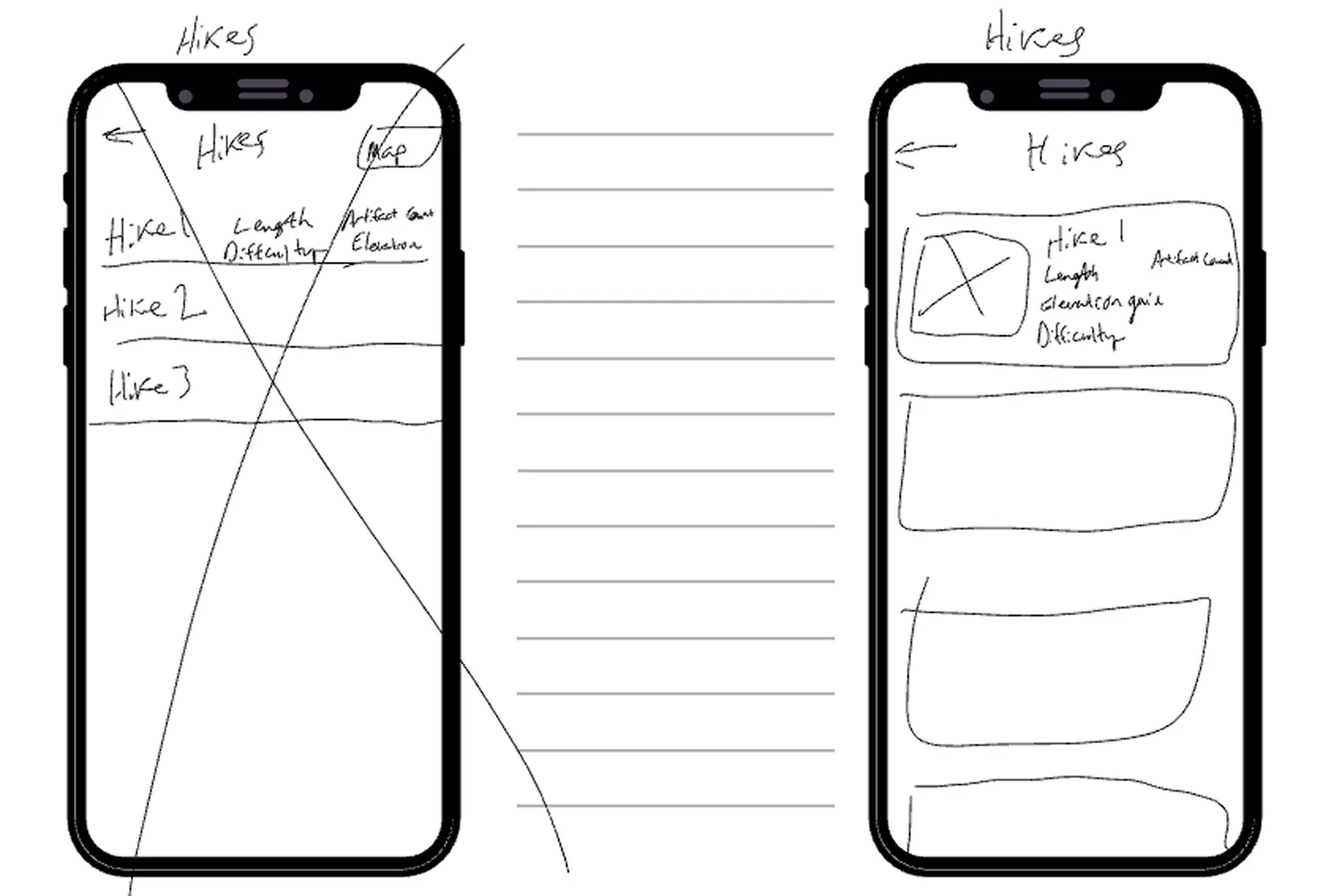
Redesigned hikes screen with better information hierarchy
Camera as Home Screen
Originally, the app opened to a menu where you could select camera mode or view your collection. After discussing with a designer friend, I realized: the main activity should BE the home screen.
This mirrors Pokémon GO's familiar structure. No need to reinvent the wheel when users already understand the pattern. It also eliminates the need for a tutorial screen.
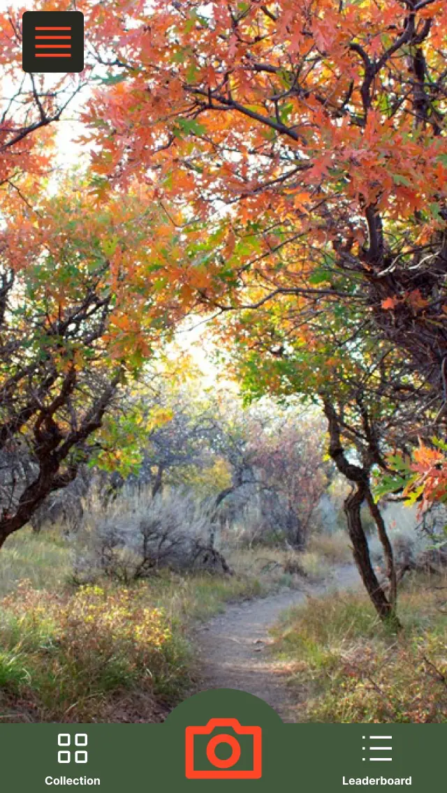
AR camera view as the primary screen
Mid-Fidelity
Draft
Mid-fidelity screens exploring the app structure before gamification elements were added.
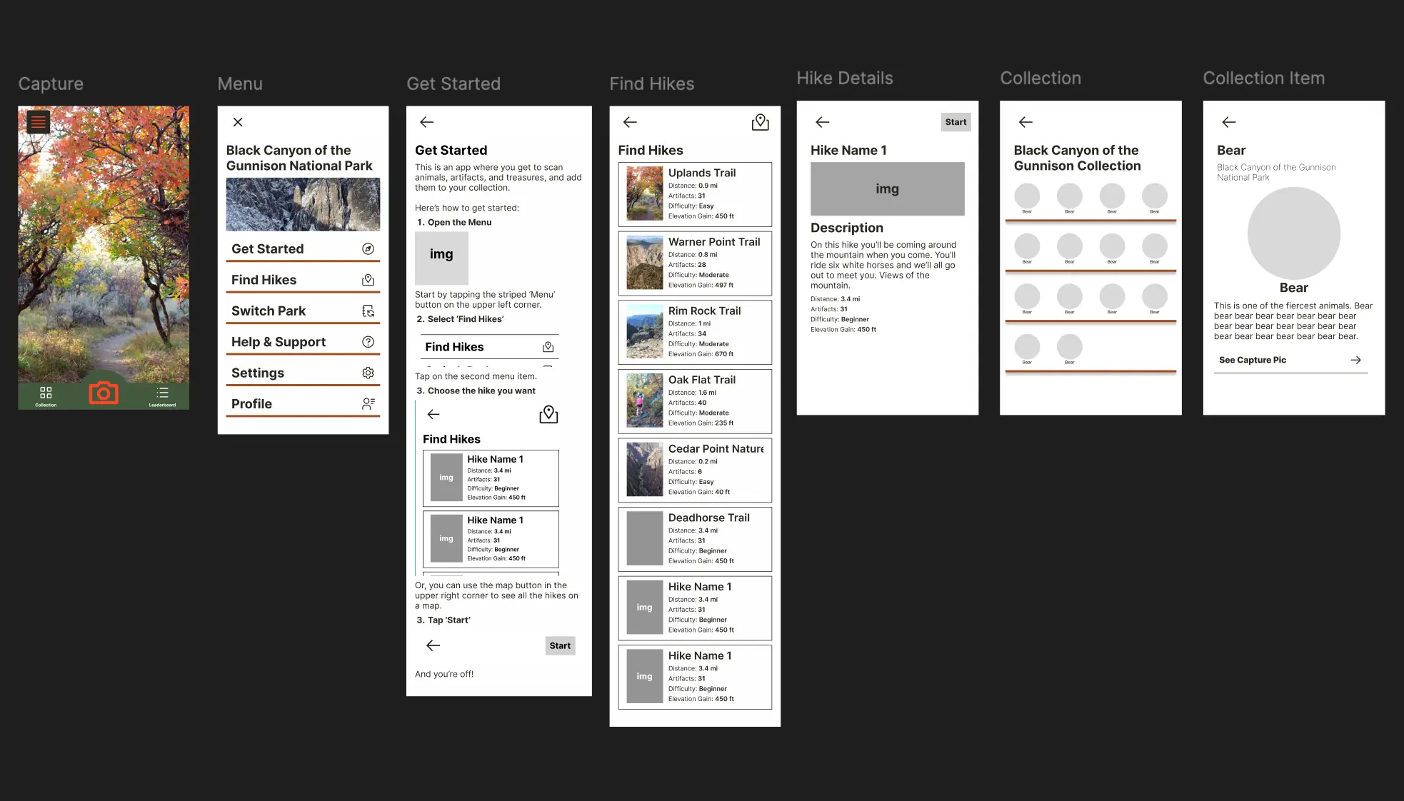
Initial mid-fidelity designs—functional but lacking engagement
The app worked. AR scanning made sense. Collections were clear. Trail info was organized. But something was missing...
The Feedback
That Changed
Everything
After presenting my initial designs in critique, Professor Steve stopped me in my tracks:
"The designs look functional, but they lack intentionality. Where's the pizzazz?"
He was right. I had created a perfectly usable app—AR scanning worked, collections made sense, trail info was clear.
But there was nothing that made you want to use it. Nothing that sparked excitement about hiking. It was utilitarian without being engaging.
This became the project's pivotal moment: How do you transform a functional design into an experience people actually desire?
The
Breakthrough
PlayStation Trophies
After discussing the "pizzazz" problem with my designer friend, we were reminded of PlayStation trophies and their rarity rankings.
The insight: The rarer the trophy, the more you want it. What if we applied this psychology to wildlife collection?
Gamification Elements
Rarity System
Common → Uncommon → Rare → Legendary animals with color coding
Collection Teasers
Silhouettes of uncollected animals drive discovery
Trail Features
Shows which animals are common on each trail
Points System
Hikes award gold points for leaderboard status
Designing for Discovery
The rarity system isn't just fun—it's a strategic tool for encouraging meaningful exploration.
Common Animals
Appear on popular, well-trafficked trails
→ Easy wins for beginners, builds confidence
Rare/Legendary Animals
Appear on challenging or lesser-known trails
→ Incentivizes adventurous exploration
The Strategic Impact
Instead of everyone clustering at popular overlooks, the app guides visitors to discover hidden waterfalls, quiet trails, and unique ecosystems they might otherwise never see.
This benefits both users (richer park experience) and the park itself (distributes visitor traffic, reduces crowding at popular sites).
The
Transformation
Adding rarity colors, collection teasers, trail-specific animal features, and a points system transformed the app from functional to engaging.
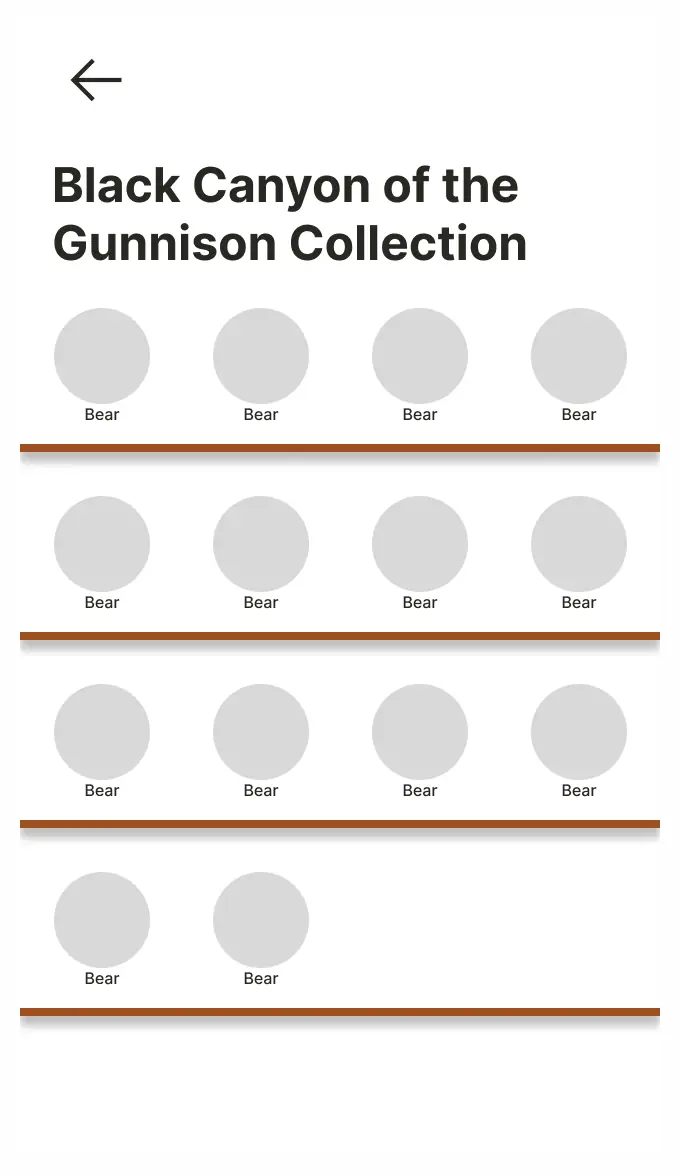
- ✓ AR scanning works
- ✓ Collections make sense
- ✓ Trail info is clear
- ✗ No emotional engagement
- ✗ No reason to explore more
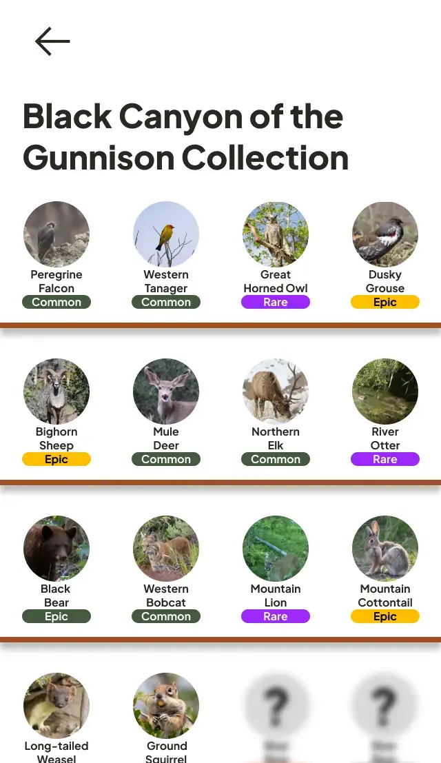
- ✓ Color-coded rarity creates excitement
- ✓ Collection teasers drive curiosity
- ✓ Trail features guide exploration
- ✓ Points system rewards progress
- ✓ Want to discover more
Final
Design
AR Scanning
Point, scan, capture—familiar interaction from Pokémon GO
Rarity System
Color-coded tiers create excitement and drive exploration
Discovery Mechanic
Rare animals on hidden trails encourage meaningful exploration
Key
Takeaways
Find the Underserved Audience
When everyone zigs (trip planning apps), look for who's being left behind (casual visitors). Sometimes the biggest opportunity is the audience no one else is designing for.
Learning: Observing patterns in class discussions and existing apps revealed a gap I could uniquely fill. Strategic positioning matters.
Leverage Proven Patterns, Don't Reinvent
Pokémon GO already solved the "get people excited about exploring" problem. Instead of creating a new interaction model from scratch, I adapted a familiar pattern to a new context.
Learning: Familiar doesn't mean derivative—it means accessible. Innovation can be applying existing solutions to new problems.
Functional is the Baseline, Not the Goal
Before this project, I focused heavily on making things work correctly: clear information architecture, intuitive flows, accessible layouts. Those are important, but they're table stakes.
The "pizzazz" moment taught me that great design needs an emotional hook—something that makes people want to engage, not just able to engage.
Learning: Always ask "Would I be excited to use this?" If the answer is just "It works fine," you're not done yet.
Features Can Serve Multiple Goals
The rarity system wasn't just fun—it strategically distributed visitors across the park, benefiting both users (less crowding, more discovery) and park management (reduced strain on popular sites).
Learning: Great design solves more than one problem. Look for features that create value for multiple stakeholders.
Project
Reflection
This project taught me that identifying an underserved audience and designing specifically for their needs can create more impact than competing in a saturated space.
The "pizzazz" critique was uncomfortable but invaluable. It pushed me beyond my comfort zone of functional design into thinking about emotional engagement and desire.
If I were to continue this project, I'd love to test the app with actual park newcomers to validate whether the gamification truly makes them more excited about hiking—and whether the discovery mechanic successfully guides them to lesser-known trails.
Interested in working together? Let's chat about making experiences more accessible and engaging.